In our primarily digital world, it stands to reason that most nonprofits now have online donation pages. There are so many benefits to offering a way for interested donors and prospects to make a gift online. The immediacy of the online option works in the organization’s favor, as one of the biggest challenges to capturing gifts is making the giving as quick and painless as possible. Filling out a reply card, addressing the envelope, finding a stamp (or worse, having to go out and buy some), and dropping it in the mail (or at least remembering to). While these may seem simple, the aforementioned checklist items are pretty tall hurdles for a donor to jump. Factor in busy schedules and the other solicitations they’re receiving and you’ve got quite a fight ahead of you.
Enter online giving. Here is a way to easily solicit and capture donations via email, social media, and your website where the page is permanently housed. With the simple click of a button, your constituents can forward that email, retweet that ask, or share that URL; and so begins the domino effect of digital fundraising. We’re not even going to get into how much more powerful this gets when you integrate other channels like direct mail or digital publishing… #sorrynotsorry
Now let’s assume that you’ve got an online donation page. Great! But here’s a little dose of reality. According to M+R Benchmarks X, the conversion rate for donation pages floated around 15% in 2015. So while you have your page up and running, chances are that despite what you think it’s not running as optimally as possible. Not to worry, we’re about to dive into the problem areas.
Spread the word
The first thing you want to ask yourself is whether or not people are aware of your online donation page. Consider where you include links to the page. You’ll probably include a link or button on a solicitation email or on social media, but are you including a link or QR code to the donation page on your direct mail reply devices? Quick, easy, apparent access to your donation portal is crucial to driving traffic to the page, thus helping to boost your conversion rate.
Add the following items to your checklist:
- Improve your calls to action. Make sure your button or graphic is bold and beautiful.
- Incorporate linked text and images throughout your website that lead to the donation page.
- Limit social media calls to action on your profile page so that your donation page link isn’t buried.
Simplify the process
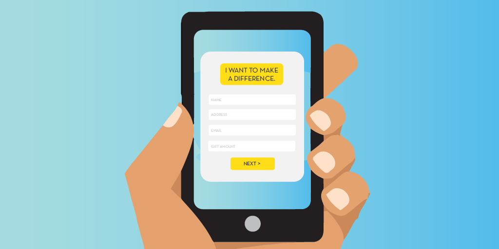
The entire online giving process should feel effortless. This means that the ability to navigate the page and complete the form should not feel like a herculean act of scrolling left, right, up and down. Left and right, you ask? Well, the majority of online giving (or most transaction-based activities) is done from a mobile device. According to npENGAGE, of 343 organizations surveyed, approximately 9.5% of the donations were made online. Considering 84% of donation pages are not mobile friendly, this is a huge problem. It means that right now, potentially hundreds of donors are bouncing from a donation page because it’s designed poorly, difficult to read, and too much of a pain to spend the time on.
What can be done? Put the focus on the task at hand by simplifying language. Tell a story with an image instead of text. Eliminate distractions by limiting text fields to pertinent information only, don’t ask superfluous questions. If there’s more information you need to know, make that part of the follow-up touch. Optimize the page for mobile devices and make it responsive. Advanced techniques include creating dynamic, personalized pages that allow information to be pre-populated and can include a variable ask-string based on donor data like giving history.
Consider the user experience
While mobile-friendly and responsive designs help ensure a top notch user experience, it’s crucial that you consider language, imagery, and overall design part of your UX checklist. Even though we said we wouldn’t delve into it too much, most organizations are utilizing multiple channels to solicit their audiences. Why does this matter? Continuity is important. Consistency of messaging and visuals enhances the legitimacy of your appeal and works to further establish trust between you and your donor. If they’re receiving one thing in the mail and opt to give online as opposed to filling out the reply card, the gift-giving experience should be almost identical. There’s nothing worse than landing on a page that doesn’t quite feel like the one you’re supposed to be on or being on the receiving end of conflicting narratives.
The Wrap Up
Since we’re already into the heaviest fundraising season of the year, start implementing these changes as soon as possible. And though we’re talking about simplifying things, that doesn’t negate the value of a good story. Stories that include evocative imagery, genuine messaging, and conjure a sense of heroism on the part of the donor will help move your visitors through the gift giving process smoothly. Don’t miss casino games out on potential donations by scaring donors away. People inherently want to give back, it just needs to be as easy as possible for them to do so.
You Might Also Enjoy:
+ You Go, PURL! How Personalized URLs & Dynamic Donation Pages Help Nonprofits Reach Their Goals
+ 5 Ways to Put Your Donation Page to Work
+ 3 Things You Might Not Know Mail Could Do
Like what you see? Stay in touch!


