Spring Cleaning: Improving Your Donation Page

Mar 22, 2017

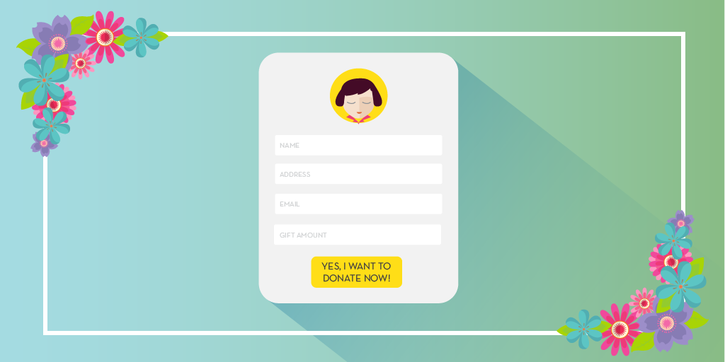
Out of however many hundreds or thousands of people solicited, a pretty decent handful are going to end up on your donation page. Basic logic should indicate to you that of that “pretty decent handful,” only a smaller-yet-equally-substantial handful will actually convert into donors. That means that this last chapter of your prospects’ donor journey is very important! There’s nothing more disappointing than having been served a series of great fundraising communications only to land on a donation page that’s too long, has too many options, is not mobile friendly or is so bare bones you’re wondering if the organization forgot to make a note that it was still under construction.

Any one (or several) of those is reason enough for a potential donor to bounce from the page, never converting and disappearing into the digital abyss. Donation pages are one of the most important aspects of a digital fundraising strategy and are too often an afterthought. But before things start to seem hopeless, there are five easy things that any nonprofit can do to refresh their donation page this spring to make it a more effective part of annual giving.

1: It’s Always Story Time

Just because you’re nearing the end doesn’t mean the story should end abruptly. Make sure that your campaign’s narrative and organization’s mission are woven into the elements of your donation page. You can do this by using photos, videos, punchy graphics and concise copy to continue telling your story in a fun and engaging way that motivates your prospects to seal the proverbial deal. No matter what you do, just make sure that this page isn’t simply a long and boring form that in no way connects with your donors, your organization, or anything relevant. That’s a recipe for disenchantment.

2: Get Creative with the Ask String

It’s great to provide prospective donors with various options for their gift amount, but it’s also easy to provide too many. Additionally, when several gift options are presented, it’s likely that donors may choose one slightly lower than they’re comfortable with. In short, you could be leaving money on the table. Play around with what this can look like for your donors. You can base options off of your donors’ average gift size, a target audience, or other data points so that you’re not over- or underestimating. Try reversing your ask string so it reads from high to low, or try out a write-in option only. Test out a variety of options until you find what works for you. It’s important to switch things up every once in a while.

If you’re able to and already familiar with versioned communications, try the same strategy here by setting up multiple donation pages. You could have pages set up specifically for young donors, mid-level donors, or for acquiring new donors. Advanced tactics here could include using pURLS that allow you to prepopulate forms making the process simple and easy.

3: Punch Up Your Call to Action

A bold call to action is a key element on your donation page, as it is on any form of communication. Here you want to make sure it’s highlighted in a way that draws attention to the final step but utilize button text in a way that connects with your underlying message. Think of your CTA as a rallying cry. “DONATE” is a fine choice, but you can go a step further by making the process more engaging by using active phrases like “YES! Count Me In!” or something fun and different like “Here’s my gift!” Make sure that you provide other pathways for engagement and set up the stewarding process by using simple checkboxes for them to opt-in to newsletters or other promotional messages that keep them in the loop with how things are going.

4: Monitor & Optimize

Just because something works once (or a few  times) doesn’t mean leave it alone forever. You can’t recycle success indefinitely, so make sure you’re always monitoring the performance of your landing page and making adequate, timely changes to keep things fresh. Prevent message stagnation by switching up the language here and there, changing out images or adding other forms of rich content.

Keep an eye on this page’s bounce rate. If a high number of people are dropping off without ever having completed their donation that’s an indicator of a disconnect. Another key metric is time spent on the page. Again, if visit duration is very low or very high and the visitor is not converting then something is wrong. Your forms could be too long or complicated, the message may need tweaking. If you have a high number of visitors accessing this page from a mobile device but your page isn’t responsive or mobile-friendly, then they’re probably having a hard time making their gift. The point is test, monitor, optimize… often.

5: Try Retargeting

As we previously stated, a donation page isn’t a standalone fundraising device. It should be treated as part of an overall digital strategy, so put on your business cap for a moment. A donation page is very similar to a checkout page on an ecommerce website. Remember those shoes you added to your shopping cart on Amazon but never actually purchased? Isn’t it strange how they’re showing up on Facebook or other websites you visited after leaving the store? It is a little strange, but more than anything it’s intentional. What we all experience daily is called retargeting, and a lot of nonprofits actually use this strategy to convert visitors who have bounced from their donation page. Many organizations have success with retargeting because it allows for their message to stay top of mind, following bounced visitors from site to site until they come back and complete their gift. If you’ve already got a social media marketing plan in place, talk to your webmaster or IT department about installing a cookie on your donation page and utilizing options like Facebook Advertising to retarget prospects who leave your site without having made a gift.

The Wrap Up

Try out some of these strategies and let us know the results! Whatever changes you make to your donation page, just make sure that you have a plan in place for what happens after a gift is made. Adequate stewardship ensures that you retain the donors you’ve acquired and gradually increase gift amounts over time. Want to learn more? Check out our latest whitepaper Three Definitive Ways to Retain Donors and Increase Engagement.

LP 1 BANNER - 1920 X 800-01

Like what you see? Stay in touch!

SOCIAL-01 SOCIAL-02 SOCIAL-03  vimeo-04


Like what you see? Stay in touch!

FREE eBook: Ask strings and the science of securing support..