Marketers are naturally consistent, using the same logo and PMS colors in every piece, limiting the number of fonts to only a few and typing page numbers in the same place on every page. This consistency is important because it gives your work a sense of professionalism and authority while providing an underlying structure to every document.
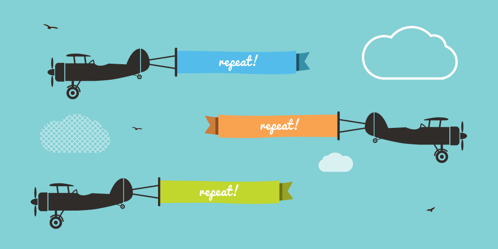
The concept of repetition goes a step beyond consistency. It is a conscious effort to unify and strengthen your marketing collateral by tying together disparate parts. Here are some ways marketers can strategically use repetition to improve the efficacy of their messaging:
Build Brand Familiarity and Credibility
Studies show that you must repeat your message at least three times before it even registers with your prospect. Ongoing customer touches allow you to build trust, a necessary foundation of any purchasing decision. Repeat your call to action in every communication. Clearly explain to your target audience what you’re asking them to do and how to do it.
Make Your Readers Comfortable
Readers more readily recognize specific columns or special sections of a newsletter if they look the same from issue to issue, allowing the reader to find what is of interest quickly. Make your piece more visually interesting by repeating a bold font, thick rule, graphic, special bullet or spatial relationship throughout your multi-page document.
Deliver & Reinforce Your Message
Use repetition not only within a piece, but also between all pieces. Use the same design style on stationery, postcards, brochures, newsletters, packaging, advertisements and your Web site. This helps the person reading your brochure know that you are the same person who sent the postcard last month.
Banish Boring
Once you have established a few key repetitive components, you can vary those items while maintaining a consistent look. Take a strong element, such as a shape, and present it in a variety of sizes, shades and positions. If there’s something that you want to call special attention to, toss in a surprise element, such as a different color, angle or graphic.
The Wrap Up
Repetition is a proven way to unify your design, add visual interest and bring clarity to your message. Identify existing repetitions and strengthen them, then create new ones to add a unique dimension to your marketing collateral.
You Might Also Enjoy:
+ How to Make Your Print Design Stand Out
+ Color Your World!
+ The 4 Principles of Visual Storytelling
Like what you see? Stay in touch!


