So, your fundraising emails are getting a ton of opens and clicks. But once potential donors arrive at your online giving page, they disappear! Few things are more frustrating for nonprofits than putting so much work into an appeal, only to see users stop short of donating. Yet, many nonprofits can’t paint an accurate picture of their online conversion rate.
If the clicks are there, you must be doing something right! Unfortunately, clicks alone don’t raise money.
The good news is figuring out and improving your nonprofit’s conversion rate is easier than you might think. If you are tracking your website interactions with Google Analytics and monitoring online donations through a donor management system, you can determine your conversion rate in three simple steps:
1. Using Google Analytics, determine the total number of unique visitors to your online donation page within a specific time period.
2. Using your donor management system, determine the total number of online donations made during that same period.
3. Divide the number of unique visitors by your online donations to determine your conversion rate.
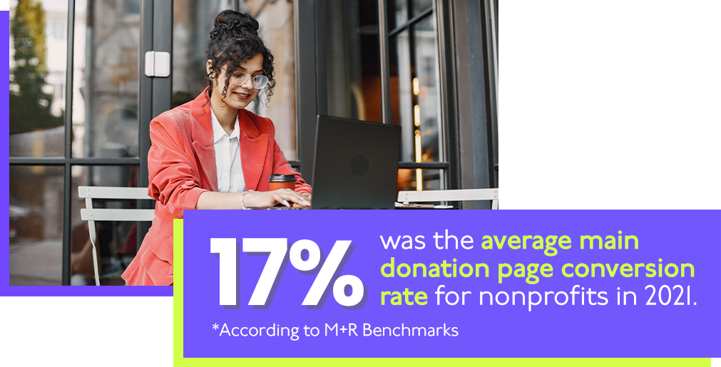
So, if 150 people visited your online giving page and your nonprofit collected 25 donations online, your conversion rate would be 16.6 percent. That’s just about on par with the average of 17 percent for nonprofits, according to the latest M+R Benchmarks report.
Blame your donation page.
But that 17 percent average is down from prior years and is too low for our comfort. If you find your conversion rate is on par with or below that average, you may be suffering from a sub-optimal donation page.
Though the end goal is different, your nonprofit’s online giving page should function similarly to an online checkout page. We’ve all been there, trying to finish up an order with a website that won’t cooperate or is a hassle to navigate. Your frustration may cause you to visit a different site to make your purchase.
Whether you’re trying to sell a product or collect donations for your nonprofit, you don’t want your visitors to abandon their shopping cart before the transaction is complete.
The following strategies will help improve your conversion rate and significantly grow your revenue.
READ MORE: Let’s talk about your online donation page.
Are you going surround sound?
Take another look at that appeal email you sent. Then, pull up your online giving page. Compare them side by side and ask yourself if the average person would know that these two communications are part of the same campaign. Is it even clear that they are coming from the same organization?
When a donor lands on an online giving page without the same branding, messaging, and other elements as your appeal, they will feel a real disconnect.
This is one of the major reasons your donors might be leaving the page as quickly as they arrive.
If your email effectively drives clicks and visitors to your page, you already have everything you need to work with.
Taking the images, messages, and call-to-action from your email and using them again on the donation page creates a cohesive experience for donors. It also keeps their reasons for giving in mind throughout the entire process.
READ MORE: The do’s and don’ts of going surround sound.
“Why does my gift matter?”
Your email is a great place to get into the specifics of how each donation furthers your organization’s mission. This information is important to donors as they want to visualize their gift’s tangible benefits.
You want to keep things shorter on your giving page than in your email. But there are ways to remind donors of their gift’s impact subtly. Consider including a picture and testimonial quote from someone your organization has helped on the giving page. This serves as a last-minute reminder of the difference their gift makes.
Another option is to compare a donor’s dollars to the impact of their gift.
Something like: “A gift of $50 provides food and medicine for 10 at-risk children.” Donors want to know the specific ways they are helping the cause and reminding them just before they give can be extremely powerful.
READ MORE: The right way to compare dollars to impact.
Don’t make giving a chore.
However, you don’t want to restate everything you said in your appeal email. Overwhelming donors with a bunch of information after they’ve decided to visit your donation page does more harm than good.
Keep your donation page short and to the point so it’s easy for donors to make a gift.
It’s also important to consider how your online donation page will look on mobile devices. Remember, 54 percent of nonprofit emails are opened on a mobile device, according to Nonprofits Source.
You don’t want mobile users pinching, zooming, and scrolling when they follow the link to your giving page in your appeal email. Be honest, when you land on a page that functions poorly on your phone, you probably back out right away. Your donors will do the same.
You should also offer several payment methods so supporters can give in the easiest and most comfortable way.
Donors with a PayPal account might instead make a click or two to log in and process payment rather than enter all their credit card information on your site. If someone lands on your giving page, they probably want to donate. But you have to meet them halfway and make the process as easy as possible for them.
READ MORE: Does your nonprofit make it easy to give?

What else might be wrong?
If you’ve incorporated the strategies above in your email appeals and online giving pages but you’re still not seeing the donations come in as expected, there are several other things to consider.
First, be sure that you are not misleading your donors. As we mentioned earlier in this post, when a donor feels a disconnect between your appeal and giving page, they are far more likely to leave before making a gift.
A donor who follows the CTA in an email about your capital campaign will be turned off if the button brings them to your annual fund donation page.
Another factor that could be holding back your conversion rate on email appeals is the load speed of your online giving page. The average user waits just a few seconds for a page to load before they back out. This could be why your online donations don’t measure up with your opens and clicks.
One simple fix is to compress the size of your image files on the page. This can drastically reduce load speeds and hopefully lead to increased giving.
READ MORE: Why your nonprofit’s call-to-action doesn’t work.
You’re already halfway there.
If your conversion rate for email appeals is well below your click-through rate, we understand your frustration. However, there is some good news.
If your emails regularly generate clicks, you’re off to a better start than many organizations!
So, you must be doing something right! After all, if your appeal emails weren’t inspiring donors, they wouldn’t make it to your donation page in the first place! It might just take a few small adjustments on the giving page itself to get those donations flowing in.


![[amplifi] - eBook pop ups and banners _Emails (Blog) FREE eBOOK: Fantastic Fundraising Emails - The complete guide for nonprofits](https://amplifinp.com/wp-content/uploads/2022/04/amplifi-eBook-pop-ups-and-banners-_Emails-Blog.png)


