We’ve all been there. Pinching, scrolling, and pinching to zoom again on a website or email that just doesn’t work well on a smartphone. Yet, many organizations are still far behind when it comes to mobile optimization for nonprofits.
Consider the following:
- Nonprofit mobile audiences grew by 26 percent last year, compared to a 3 percent average increase in email list size, according to M+R Benchmarks.
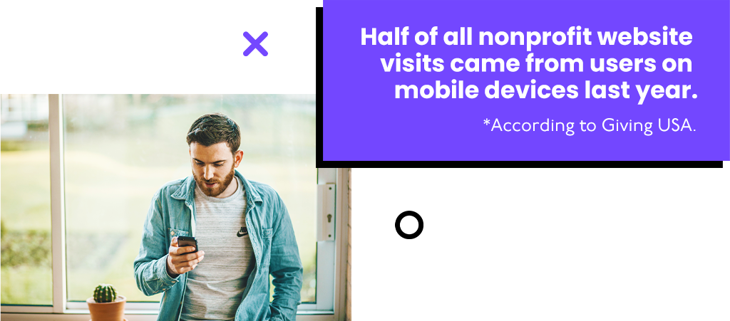
- Half of all nonprofit website visits came from users on mobile devices last year, according to Giving USA.
- The average webpage takes 15 seconds to load on a mobile device, according to Think with Google.
- 53 percent of mobile users will leave a page that takes more than three seconds to load, according to Think with Google.
- 54 percent of nonprofit emails are opened on mobile devices, according to Nonprofit Source.
Potential donors will leave as soon as they arrive on your website if it doesn’t perform well on a small screen.
Unoptimized emails may get opened. But you won’t get the clicks you need to drive users to your online giving page!
It’s time for an upgrade if your website or emails look like they were designed in 2005. After all, you’re probably missing out on donations from mobile users who had a hard time navigating your site or reading your email!
So, what can you do about it? Here are some ways to approach mobile optimization for nonprofits who have yet to get on board!
Responsive designs are the way to go.
Here’s some good news. Today, most web hosting services know how important mobile optimization is. So, they offer responsive web designs that are created with mobile users in mind.
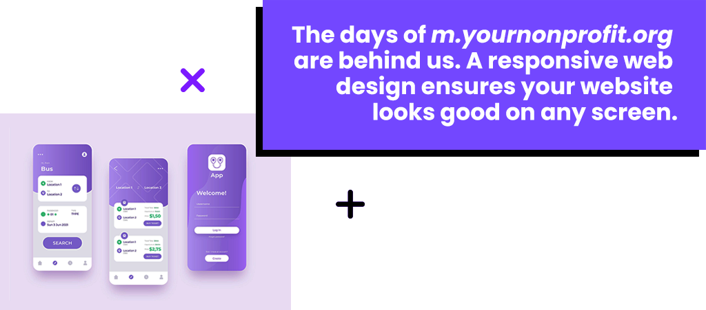
The days of m.yournonprofit.org are behind us. Responsive website layouts have made creating a separate mobile version of your website an unnecessary step in mobile optimization for nonprofits.
Responsive websites automatically determine and accommodate a user’s screen resolution and size. That’s why they look great no matter what device you view them on!
If you have a relatively new website, chances are your site was built with a responsive design. If not, the most common web hosting services, including WordPress and Wix, automatically incorporate them on new websites.
Switching to a responsive design is the easiest way to alleviate the need for users to pinch, scroll, and zoom to navigate your website.
READ MORE: The do’s and don’ts of going surround sound.
Create a smooth experience.
It needs to be easy for users to fulfill the action you want them to take. This means getting them to click on specific buttons and links. This is crucial to help donors reach your online giving page from an email or navigate there from your homepage on their own.
So, make them large, bright, and surrounded by some whitespace so they really stand out.
You will also want to reduce the number of clicks it takes a user to fulfill the desired action once they land on your website. So, ditch those drop-down menus and make your donation forms as short as possible.
READ MORE: Why your nonprofit’s call-to-action doesn’t work.
Don’t make them wait.
Improving the load speed of your webpages and emails is an essential part of mobile optimization for nonprofits.
If you notice that your site takes forever to load and you want to do something right away, start by compressing images on your site and in your emails. Do you have images with huge file sizes? If so, you can significantly cut back on the resolution without effecting quality.
That alone could improve your load speeds considerably. However, you should bring your concerns to your web developer if your pages still take too long to load. They can assist in things like minimizing code, leveraging browser caching, and reducing redirects.
FREE eBOOK: Donor retention – Are you deserving of long-term support?
Simplify your website.
Simple, single-page websites are a great way to improve the experience for mobile users.
Remember, your audience won’t stick around if a webpage takes too long to load. So why would you make them wait again every time they want to see a different part of your site?
Single page websites show visitors information in the order you intended it to be viewed. You can create clickable buttons at the top of the page to help users navigate to different sections. Rather than open a new page, these buttons will scroll down to the desired section for the user automatically.
However, to do more with less, your web designer will need to have excellent editing and organizational skills.
But mobile users will be intimidated by huge walls of text, even if they are filled with great information! So, if you use this approach to mobile optimization for nonprofits, you will need to keep it short and sweet by prioritizing what is most important for users.
READ MORE: How to identify gaps in your online giving strategy.
Stuck in the stone age.
If your organization is struggling to raise money online, you should look into what you can do to become more mobile friendly.
In a world where we pay bills, send emails, organize our calendars, take photos, post to social media, and so much more all on the same device, can we really expect donors to put down the phone and boot up a computer to engage with their favorite nonprofit?

