There’s probably a lot on your mind when it comes to fundraising events. After all, it takes a lot of planning and preparation to host a successful fundraiser. So, make sure you don’t skip the crucial first step of developing effective event branding!
As you know, branding is more than a catchy name, slogan, and color scheme. Yes, these are elements of any strong brand, but effective event branding involves so much more.
Whether in person, virtual, or hybrid, your event needs to feature a brand that communicates why this occasion is so important. It should make it clear how this fundraiser ties into your organization’s mission and work. And it needs to be featured in every element of your event and your related outreach.
But too many nonprofits fail to see their event related communications as part of the bigger picture. They focus more on designing and sending individual pieces, rather than creating a cohesive brand for the event.
And that’s why branding must come first! An effective brand will make it easy for your audience to connect the dots between your communications, the event itself, and your mission.
Developing a mission-focused brand.
Hopefully, you came up with a creative name for your event that highlights what the day is all about. Something like “Our Annual Gala” is not going to cut it. It’s time to get creative!
Your event’s name and brand should explain why this fundraiser is a crucial part of how you make the world a better place. So, keep your organization’s mission in mind.
For example, an association of astronomers focused on opening doors in the profession for the next generation could call their event “Reach for the Stars” or “Worlds of Difference.”
But remember, a name is just one part of effective event branding. The way you communicate the significance behind the name, including why your cause matters, why the event is essential for your mission, and why someone should attend, will be the core of your brand, communications, and the event itself.
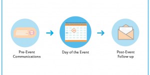
From “save the date” to “see you next time.”
Alright, alright. We know you’re excited to start thinking about your event and the details surrounding it now that you’ve established your brand. But let’s slow down and plan your outreach strategy before we worry about the big day itself!
Many nonprofits mail a well-designed postcard as their initial save the date. This is how you will introduce your event branding to your audience. A save the date postcard that can be put up on the fridge and gets attendees interested and excited helps make a good first impression.
Still, others may find a digital save the date more cost effective. If your event is more low-key or more focused on awareness and relationship building than fundraising, you can save a lot of money on printing and postage by going digital. Just remember to keep your event branding front and center.
However, we do recommend sending the invitation itself as a direct mailer, especially for more upscale fundraising events. A printed invitation demonstrates a seriousness about the event and respect to the recipient that does not come through as well digitally.
As always, it’s important to go surround sound.
So, send emails to follow up your direct mail invitation and remind those who have yet to RSVP about upcoming deadlines. And don’t forget to link to your online registration page!
FREE eBook: Fantastic fundraising emails – The complete guide for nonprofits.
Go surround sound.
You may also experiment with text message reminders to take your integrated communications strategy to the next level. This is also a great way to get attendees used to receiving texts from you if you’re using a text based giving strategy at your event itself!
Remember, your work is not done when attendees walk in or out the door! You’ll need to build a communications pipeline to follow up with supporters after your event. Again, this will feature your event’s brand and should keep attendees excited, engaged, and ready to make an impact.
READ MORE: The do’s and don’ts of going surround sound.
Event branding should connect the dots.
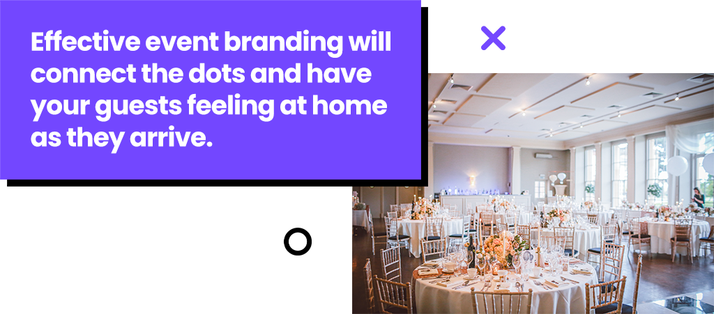
A big part of any brand is the sense of familiarity. When your attendees arrive, they should feel at home before checking in. So, revisit your invitations again before designing any signage for your event.
Doing twice the amount of work creating new imagery for your event is not just a waste of time.
You’re actually doing more harm than good by not repurposing your materials!
Conflicting visual elements can distract your audience and cause attendees to disconnect from your mission and the brand you’ve worked hard to develop.
So, make sure your signage reminds attendees of the invitation they received months ago. This will bring the reasons they wanted to attend the event in the first place back to mind. And this can cause them to give more when the time comes.
Graphics, pictures, color themes, and language should remain consistent throughout your event communications strategy. And your event itself needs to be part of that plan.
You should also consider how color affects an event space. Choosing the right color palette for your industry event can leave a lasting impression on attendees and acts as a bridge between your event outreach and on-site activities. This generates value and brand awareness in people’s minds. It allows them to remember your brand and even start self-promoting it subconsciously.
READ MORE: Keep donors engaged by repurposing your nonprofit’s content.
On the event floor.
You should put as much thought into the design of your event floor as you do into your event invitations and website. No, we’re not talking about how many chairs to put at each table.
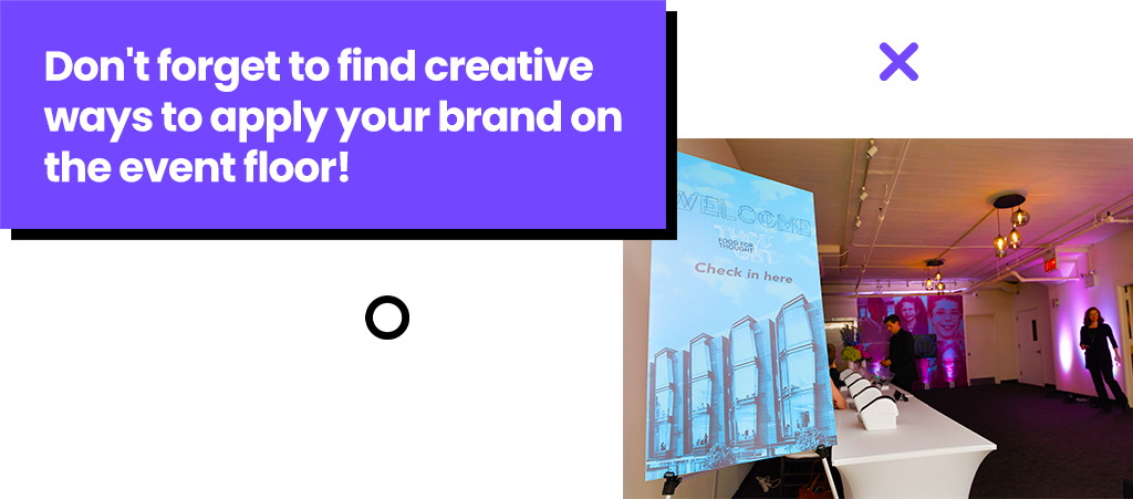
It’s important to look at the event floor as another branded element in your communications strategy. You’ll need to think strategically, so you can remind attendees why they came, no matter where they are at your event.
Many big open floor venues have large pillars throughout the room. And you can use this negative space to showcase your event’s brand!
A large, plain white column in the middle of the room can be a distraction. So, hang some gallery signs on these pillars instead. Show the people and faces that your organization works to support. Or highlight statistics that demonstrate the impact of your organization’s work.
Rather than getting lost and staring into space, your attendees will see familiar imagery that re-enforces your event branding.
Take the same approach to any entrance ways or long hallways at the venue. Is that corridor between the coat check and the main ballroom just a hallway?
Or is it a gallery featuring visuals that communicate the impact of your organization’s work?
But don’t stop there! You can also create branded wayfinding signs to direct attendees around the event floor. Most venues will have house centerpieces, like a flower arrangement. These look great on their own. But you can create “centerpiece cubes” that wrap around the base and feature branded images and fast facts about your mission.
The “wow” factor.
There are a few things every event attendee should remember about your big day. And it’s great if you serve a delicious meal. But you’ve probably made a mistake if that’s the only thing that sticks with your guests weeks after the event!
There are three things event attendees should come away thinking.
- Wow! I’m so glad I went to the event, gave, and made a real difference.
- Wow! This organization really cares about the cause and its donors.
- Wow! I can’t wait until next year. I want to make a bigger impact now!
But you will need to put in the work well ahead of time if this is what you want your guests thinking after your event. And that’s why effective event branding is the first step.


